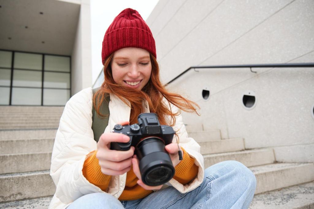
Editing 101: Basic Photo Editing for Beginners

Chosen theme: Editing 101: Basic Photo Editing for Beginners. Welcome! Today we strip away confusion and build confidence with practical, friendly steps that make your first edits feel natural, purposeful, and fun. Subscribe, ask questions, and grow along with a community that celebrates small wins.

Start Smart: Your First Steps in Editing 101

Pick a tool that invites practice, not panic. Snapseed, Lightroom Mobile, and Apple or Google Photos all offer gentle learning curves, helpful auto tweaks, and undo freedom. Start with one app, explore a few sliders, and celebrate each tiny improvement you notice.

Start Smart: Your First Steps in Editing 101

Import your photo, duplicate the original, then follow the same order: crop, straighten, exposure, color, local tweaks, and save. Consistency speeds learning because your brain recognizes patterns. Keep notes, save versions, and compare results calmly before moving on.

Composition Tools: Crop, Straighten, Rotate

Use cropping to remove clutter and clarify intention. Try the rule of thirds, give your subject breathing room, and don’t fear negative space. Post a before‑and‑after crop to feel how the viewer’s focus shifts with just a few subtle boundary decisions.

Composition Tools: Crop, Straighten, Rotate

Turn on the grid and align horizons, door frames, and lampposts. Architecture and seascapes especially need steady lines. If perspective feels off, try the transform tool gently. Practice with three photos today and watch how order calms the overall image.

Light 101: Exposure, Highlights, Shadows

Begin with the exposure slider to set overall brightness. If the photo feels flat, reduce exposure slightly and add subtle contrast later. Watch faces and skies carefully. Aim for balance that feels natural rather than overly bright or dim, especially on phone screens.

Light 101: Exposure, Highlights, Shadows

Highlights bring back sky detail, while shadows reveal gentle depth in darker areas. Nudge both carefully to avoid a gray, washed look. If your scene loses sparkle, ease off. Thoughtful restraint keeps textures lively and protects the mood you experienced in the moment.

Color Basics: White Balance and Tone

Auto white balance is a good start, but try manual temperature and tint to match the scene’s feeling. Cooler tones can suggest crisp morning air; warmer tones can feel cozy and nostalgic. Adjust slowly until neutrals look believable and the mood aligns with reality.

Color Basics: White Balance and Tone

Saturation lifts all colors equally, while vibrance protects skin tones and raises muted colors more gently. For beginners, vibrance often feels safer. Increase carefully, then step back and check if the image still looks human and inviting, not neon. Less is usually more here.

Retouching Gently: Heal, Sharpen, Reduce Noise

Use the healing tool to remove small sensor spots, blemishes, or stray litter. Zoom in, tap gently, and avoid repeating patterns that reveal edits. If cloning, vary your source points. Aim to tidy a scene while preserving authenticity, not to rewrite the moment entirely.

Retouching Gently: Heal, Sharpen, Reduce Noise

Sharpening enhances edges, but too much creates halos and sandpaper textures. Apply light capture sharpening, then consider output sharpening for web or print. Preview at actual viewing size. If eyelashes look brittle or foliage turns crunchy, you’ve gone too far—dial it back.

Filters and Presets: Learn, Don’t Lean

Apply a preset, then open the sliders and note every adjustment. Reverse one change at a time to feel its impact. You’ll develop instincts for exposure, color, and contrast. Comment with a preset you studied and what it taught you about your personal preferences.

Filters and Presets: Learn, Don’t Lean

Create a gentle baseline look: refined white balance, modest contrast, soft vibrance, and a touch of texture. Save it, then apply selectively. Consistency helps a photo series feel intentional. Want a walkthrough? Subscribe and request a step‑by‑step preset recipe tailored to beginners.

Export, Formats, and Sharing Etiquette

For most photos, JPEG in sRGB color space is perfect for web sharing. PNG suits graphics or text overlays. Resize thoughtfully to fit platforms, and keep an original, full‑resolution copy safe. If space allows, back up edits and the untouched original for peace of mind.

Export, Formats, and Sharing Etiquette

Aim for 80–90 percent JPEG quality, resize the long edge for your platform, and keep subtle sharpening for output. Check how the image looks on phone and desktop. If compression introduces artifacts, nudge quality higher until edges and gradients appear clean and natural.

Export, Formats, and Sharing Etiquette

Add alt text describing the scene, credit collaborators, and caption briefly how you edited. Encourage constructive feedback and invite others to try your steps. Tag our community so we can celebrate your progress and feature helpful examples for future beginners to learn from.

Export, Formats, and Sharing Etiquette

Lorem ipsum dolor sit amet, consectetur adipiscing elit. Ut elit tellus, luctus nec ullamcorper mattis, pulvinar dapibus leo.


Insvrgence
Privacy Overview

This website uses cookies so that we can provide you with the best user experience possible. Cookie information is stored in your browser and performs functions such as recognising you when you return to our website and helping our team to understand which sections of the website you find most interesting and useful.